
Creating the Contents Page.
I began creating the page by starting with the Title which was styled the same as the 'Paparazzi' title of the Front Cover. So I used the Font Tool and selected the same font used for the title ('Will & Grace'). I used the hue/saturation adjustment option to change the alter the colour of the text to the same yellow as included on the front cover, and added the shadow using the tool down the right-hand side to adjust the background to create a background shadow similar to the main title. I placed it in the central position at the peak of the page. Next, I wanted to add the detail so I opened the Ink Splatter I acquired from the internet and using the selection tool I was able to get the section of the ink I wanted to use. I then used the Magic Lasso Tool to get select the entire image, I then pressed delete option to eliminate any background excess, and then selected inverse to select the image itself, I then copied and pasted it onto the contents page, changed the layer and adjusted it to the size I wanted it. This added a different effect to give the magazine an edgier look.

To make my magazine look more professional, I decided I wanted to included a smaller version of the Front Cover so I opened the Front Cover in photoshop in separate window and then selected all the layers to flatten the image, I next saved this and opened it again in photoshop. I then used the selection tool to select the image, then copying and pasting it onto the contents page I used the move tool to shrink the image, so it would not dominate the page. I then angled the image so it would look different and so it would fit behind the contents page title. Next, I wanted to make the magazine seem real so I used the same text in which I used for the 'Contents' and 'Paparazzi' titles ('Will & Grace') to create a website advertisement for the magazine in the excess space left at the top of the page. I done this using the font tool and adjusting the colour using the colour option at the top of the page to change the colour to the same colour as the 'Melodie' title on the front cover, which follows the bright colours theme. Then, I needed a title which directed the audience towards the features of the magazine, so I used the font tool to create this title, but I used my alternate font rather than the same font used for the contents page title. I made this font black and slightly smaller than the title for the page so it does not dominate the page over the main title for the page. I modified the size of the text using the move tool.

The next for me to take was to create the stories for the contents page, I opened a text box and within it I wrote the page numbers, the titles for the stories and minor details about the stories to lure the audience. After this was completed, I then decided to adjust all the font styles, sizes and colours. First was the font styles, for the details and the page numbers I used the 'Lauren Script' font and for the main title of the stories I used 'Will & Grace', which has been prominently used for titles across the magazine. Next came the size of the text, I decided that the numbers should be slightly larger than the titles and significantly larger than the details of the stories so the audience can clearly see the page number for each story, and also that the details for each story should be smaller than the titles. Finally, I decided that the text should all be black to contrast to the white background but using the hue/saturation adjustment changed each other page numbers to Pink, the same colour as 'Melodie' title on the front cover.

I wanted to add images to the page next, so I open each image all of which already had enhancements previously made so they were ready to be utilized on the contents page. I placed them in ascending order from bottom image in the order they would be featured in the magazine. Next, I needed to add detail to them so they would look more interesting to the audience so I used the custom shape tool create backgrounds for the images and used the hue/saturation adjustment to make them bright pink and I then used shadow and outer glow effects to enhance the shape outline, positioning them behind each image, using the move tool to adjust the size so it fit behind each image just right.
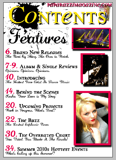
Ultimately, I wanted to add the final details to the page to make the page seem more professional and so I added correlating page numbers to each image so the audience could locate the accompanying story. I also added the artists name to add to the detail factor of the magazine, and with the main story of the magazine I also added an 'Exclusive' advertisement to it so that the audience become more drawn towards it. Finally, I added another 2 exclusive advertisements and 1 Artist name using the same style as the titles using the bright colours and shadows to attract the audience towards it and to add an extra feature to the magazine. This adds to the detail of the magazine, making is attractive and colourful for the audience, yet lures them towards more features of the magazine. Ultimately creating my final product, which is located the the top of the page.
No comments:
Post a Comment