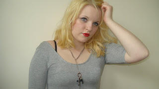
These are some of the images which I felt were not suitable or did not work well enough for the final product. All the images vary in reasons as to why they did not fit.

For this image it is clear that the light is too strong and blocking out her facial expression. Also, she is turning away from the camera and so we have not got a significant view of her mien. The posture is she is embodying is strong, yet delicate so it works but because there is no space around the outside to fit elements of a Front Cover, for example, the image does not work.
The angle this image has been shot in does not work, the picture is looking down on the Model and it is a sideways view of her so it cannot work for any element of the Magazine. Again, she is looking away from the camera so we do not receive a eloquent view of her facial expression, only a sideways view. This is not a strong enough image to use within the Magazine and it would be difficult to include Magazine factors around the edges of the image.
This image can be seen as strong, her pose and facial expression work well together as well as working well with the theme. The angle the image is taken in is good, it is direct and full on, and the extra space around the edge allows space for other elements of the Magazine, depending on the section. But although the pose is strong, it is not as strong as other images.
The angle this image has been taken in does not work, even if the image was turned the angle would still be unusual and hard to work with. Also, the position and the posture of the Model is embodying isn't strong enough as well as being a side view of the Model, we don't get a full view of the Models face.
With this image, the picture is taken at an angle which can be difficult to work with and her pose is not as strong as other images. Plus, if the image was condensed down to fit an A4 page, the image would look too compressed and distort the image. Her facial expression and body posture is strong but the image can be difficult to work with.
Again, this image is a strong image but we are unable to obtain a full view of the Model's facial expression as well as not having enough view of the rest of her body in this image. Also, the image is too wide and there would be some issues with compression of the image to fit in onto an A4 page. But the pose and mien are once again strong and work well, but it is the angle, shot capacity and width of the image that cause the struggle.
This image is very similar to another image from the Main Model Material in which could possible be featured within the Magazine. But for this image, the space around the edge would need to be cropped, her body is too static and her pose is not as strong as other photographs. Although the Make-Up & Hair emit the edgy look, the overall image is not powerful enough.
This image is similar to the latter of the images, her make-up and hair are bold, and the space around the edges allows area for Magazine Elements to be included. But, the pose and posture are, once again, not as strong as other images.

With this image, it differs from the other image as this is the only image which features the Model wearing a leather jacket and her tied back so we can see more of her facial expression. It is similar to that of the Content Material, and the pose is not as strong as other images. Even though there is space available around the edges, enough room for PUGs etc. the image does not work.


No comments:
Post a Comment